What is colour psychology in web design?
Colour psychology is the study of how hues affect human emotion, perception, and behaviour. Applied to web design, it means choosing a palette that triggers the right emotional response in your target visitor at the right moment — before they read a single word. Research published in the journal Colour Research & Application suggests that up to 90% of snap product judgements are based on colour alone, and colour is processed in roughly 90 milliseconds — far faster than any headline can be read.
For Canadian businesses in competitive markets like Toronto, Vancouver, and Montréal, where a visitor decides within seconds whether your site feels trustworthy, getting colour right is a business decision disguised as an aesthetic one.
Web design colour psychology operates at three levels simultaneously. The first is cultural association — red means urgency and stop in North American culture; in many East Asian markets it signals luck and celebration. Canadian web designers need to understand both because Canada's multicultural demographics mean your visitor population is not culturally homogeneous. The second level is category signalling — healthcare sites use blue and white because decades of institutional design have trained visitors to associate those hues with cleanliness and care. Breaking category convention without strong reason creates subconscious friction. The third level is contrast and visual hierarchy — regardless of hue, the element with the highest visual contrast attracts the eye first. This is why a well-placed button in an unexpected but high-contrast colour can lift click-through without relying on any emotional association.
Understanding all three levels lets you make deliberate decisions instead of defaulting to personal preference or blind competitor imitation.
Why colour decisions affect conversion rates
The link between colour and conversions is documented and quantifiable. The most-cited example — HubSpot's A/B test changing a green button to red — produced a 21% lift in clicks. The lesson is not "always use red." The lesson is that button colour matters, contrast from surrounding elements matters, and the emotional context of the visitor matters. Red worked in that test because it contrasted against a predominantly green page and introduced urgency without damaging trust in that specific content context.
For Canadian e-commerce businesses competing against US giants with massive testing budgets, colour strategy is a cost-effective lever. Changing a CTA button colour costs nothing and takes minutes. Getting it right — through testing or informed defaults — can permanently improve conversion without touching ad spend or content.
Credibility is the less-discussed side of colour's conversion impact. Visitors who land on a site that looks visually inconsistent or uses colours associated with the wrong sector experience what researchers call aesthetic-usability friction — a subconscious sense that something is wrong. They leave without being able to identify why. A study by researchers at the Technical University of Denmark found visual consistency was the second-strongest predictor of perceived website credibility after content accuracy. Consistent, appropriate colour signals competence before your copy does.
Canadian context also matters regionally. Québec consumers in certain categories show stronger preference for sophisticated, understated palettes — the Parisian influence is real in branding decisions. Western Canadian audiences in trades and outdoor industries respond more strongly to bold, grounded colours. A national campaign may need regional palette variants. This doesn't require separate sites, but it should inform which design gets A/B priority in which region's paid traffic.
The bottom line: colour psychology is not about picking a "lucky colour." It is about systematically reducing the gap between what a visitor expects to feel on arrival and what your design delivers in the first three seconds.
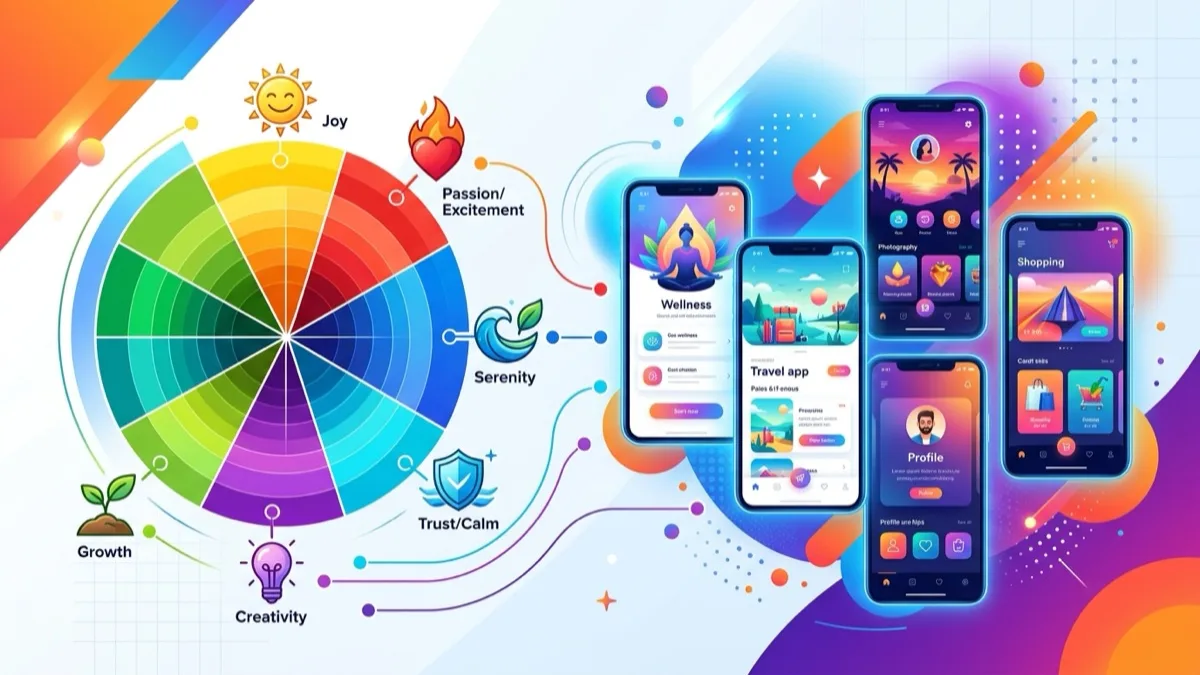
The emotion map: what each colour signals
No colour is inherently good or bad for conversion. Every hue activates a set of emotional associations, and your job is to match those associations to your brand promise and the visitor's emotional state at the moment they arrive. Here is the practitioner's map:
Blue is the most trusted colour in North American web design. It signals reliability, expertise, and calm. Banks, tech platforms, and healthcare providers lean on blue because visitors associate it with institutional stability. The specific shade matters enormously: navy projects authority and tradition; sky blue suggests approachability and transparency; electric blue signals innovation and speed. Dark navy paired with white body text is the single most conversion-tested combination in financial services.
Green signals health, growth, and environmental responsibility. Since the pandemic, green has broadened from eco-brands to health, wellness, sustainable finance, and SaaS. It also exploits the "go" signal that is deeply wired in North American audiences raised with traffic lights. A green CTA on a white page bypasses urgency-alarm associations while avoiding the passivity of neutral grey.
Red activates urgency and appetite. It raises resting heart rate slightly, which is why it dominates food brands, retail sale tags, and subscription cancellation warnings. As a CTA colour, red outperforms in some contexts — particularly where urgency is the right emotional note — but underperforms significantly in trust-sensitive verticals like finance, healthcare, and legal services, where visitors associate red with warning and danger.
Orange is enthusiastic and energetic without red's aggressive urgency. It is the brand colour of approachable mid-market companies and performs especially well for calls to action on sites with blue-dominant palettes, because blue and orange are complementary colours — maximum contrast with none of red's alarm-bell baggage. For Canadian trades businesses (plumbers, HVAC, electricians), orange is the statistically strongest CTA performer across market research aggregated from Toronto, Calgary, and Vancouver service pages.
Yellow is the most visually attention-grabbing hue at small sizes but tires the eye fastest at large areas. Use it as an accent, highlight, or badge, not as a dominant background or primary brand colour. In Canadian B2C retail contexts, yellow signals cheerfulness and affordability — valuable in entry-level pricing tiers, problematic in premium positioning.
Purple conveys luxury, creativity, and wisdom. In service businesses, it reads as premium and distinctive. Cosmetics brands, premium consulting firms, and SaaS companies targeting enterprise buyers frequently use purple to escape the sea of blue competitors. Deep violet signals gravitas; light lavender reads as creative and feminine-leaning. Know your demographic before committing to purple.
Black and dark charcoal signal premium, editorial, and precision. Luxury brands, photography studios, architecture firms, and enterprise SaaS companies that want to signal seriousness use dark-dominant palettes. The risk: on a budget monitor with poor contrast rendering, very dark palettes can look muddy and difficult to read. Test on real mid-range hardware before committing.
White and light neutrals create breathing room, cleanliness, and cognitive ease. Heavy use of white increases perceived page speed and reduces the cognitive load of processing information — readers focus on content rather than layout noise. White-dominant palettes are standard in healthcare, SaaS, and e-commerce, where the product or message should dominate the visual field.
Colour meanings reference table
Use this table as a first-pass filter when choosing or auditing a palette. The "caution" column is as important as the primary emotion — many colour mistakes come from ignoring the downsides.
| Colour | Primary emotion | Trust level | Best-fit sectors | Caution |
|---|---|---|---|---|
| Blue | Trust, stability, calm | High | Finance, tech, healthcare, legal | Can feel cold or generic if overused |
| Green | Growth, health, go | Medium–high | Health, eco, SaaS, finance | Bright greens read as cheap in luxury contexts |
| Red | Urgency, appetite | Low–medium | Food, retail, hospitality | Raises anxiety in finance/healthcare contexts |
| Orange | Enthusiasm, warmth | Medium | Trades, SaaS, B2C services | Looks cheap paired with the wrong secondary |
| Yellow | Optimism, affordability | Low | Retail, kids, food | Strains eyes at scale; low contrast on white |
| Purple | Luxury, creativity | Medium–high | Cosmetics, premium services, SaaS | Reads as feminine to some demographics |
| Black / Dark | Premium, editorial | High | Luxury, fashion, enterprise | Can feel inaccessible to older audiences |
| White / Neutral | Clarity, simplicity | Medium | Healthcare, SaaS, e-commerce | Without accents, feels empty and unfinished |
Common colour mistakes Canadian SMBs make
The most common mistake is choosing colours based on personal preference. A plumber who loves navy buys a template in navy; a florist who "feels" yellow builds a yellow site. Neither choice is grounded in the emotional state of the visitor at the moment they land, what competitors already own visually, or what the brand needs to signal to convert a cold visitor into a paying client.
The second mistake is inconsistent application. Many Canadian small-business websites use four or five colours with no defined hierarchy — the logo is one palette, the buttons are another, the testimonial section has its own background, the blog uses a fourth. Inconsistency breaks trust subliminally. Visitors cannot articulate the problem, but they feel the site is amateurish. Research from Denmark's Technical University found visual consistency to be the second-strongest predictor of perceived website credibility, after content accuracy.
Third: ignoring contrast for the sake of aesthetics. A beautiful sage green on a cream background may look stunning in a design mockup and fail WCAG 2.1 AA contrast at 3:1, meaning a significant share of Canadian visitors — including the roughly 8% of males with some form of colour vision deficiency and the 1 in 8 Canadians over 65 with partial visual impairment — cannot read it comfortably. Accessibility is not optional for businesses subject to Ontario's AODA or the federal Accessible Canada Act.
Fourth: copying a large brand's palette without the brand's context. The reason a global tech company's all-white site with a single brand-colour pop works is because they have years of built recognition — visitors already know the brand. For an unknown business, that restraint reads as unfinished. You need enough colour presence to communicate category membership and brand personality before the visitor trusts you enough to engage.
Fifth: treating colour as a one-time decision. Your palette needs to be documented as a CSS variable set and enforced across every page, every campaign landing page, and every third-party integration (booking widgets, chat plugins, embedded forms). A brand colour palette that looks unified in Figma and then fragments across a live site because inline styles were hardcoded into 200 different pages is a maintenance disaster. Define your palette as CSS custom properties at the `:root` level and reference variables everywhere else.
Industry colour palettes: what each sector expects
Different sectors have trained their audiences to expect specific colour signals. Breaking those expectations without a strong reason forces the visitor to work harder to categorize your business — cognitive friction that almost always hurts conversion, especially on first visit from paid traffic.
Healthcare and dental: Blue and white dominate, often with green or teal accents. The palette signals cleanliness, clinical precision, and calm — exactly what a patient needs to feel before booking. Sites that deviate into warm reds or oranges in this sector see measurably higher bounce rates. If you want to differentiate, adjust the specific blue (teal-forward vs navy-forward) rather than abandoning the hue category entirely.
Trades and home services: Orange, red, and yellow are common for energy and urgency — they signal speed and value. Navy and charcoal are used in the premium tier to suggest established trustworthiness. Toronto-based contractors who have tested both report that orange buttons consistently outperform grey or blue on service landing pages. The "orange button on a navy header" combination is arguably the most battle-tested in the Canadian trades market.
Legal: Navy, charcoal, and white. Conservative by design — the palette signals stability, authority, and permanence. Law firms that have experimented with bright brand colours have generally seen client acquisition challenges with demographics over 45, who represent a disproportionate share of legal service buyers and who read colour convention deviations as inexperience.
Restaurants and food: Red and orange dominate, because both hues have documented appetite-stimulating effects. Fast food brands have used this research for decades. Artisan, organic, and farm-to-table brands pivot to earthy greens, warm creams, and natural browns to signal quality and sustainability. Notably, blue is the colour that most consistently suppresses appetite — avoid it as a dominant colour in any food-related context.
Finance and accounting: Blue-dominant with white, occasionally with green accents to signal growth and prosperity. Gold and dark navy combinations signal wealth management. Canadian fintech startups increasingly use purple or teal to differentiate from incumbent bank palettes — it signals innovation within a trust framework.
E-commerce (general): White-dominant with one strong brand colour and one accent CTA colour. The goal is to let product photography dominate — heavy brand colour competes with products for attention. See the website examples by industry guide for real-world Canadian e-commerce palette breakdowns.
SaaS and tech: Gradient-heavy as of 2025–2026, often combining deep blue, purple, and electric teal against dark or white backgrounds. The gradient signals modernity and technical sophistication. The risk is that gradients date quickly — if yours looks indistinguishable from a 2021 Figma Community template, it signals the opposite of innovation.
Wellness and fitness: Energetic oranges, vibrant greens, and electric blues against clean whites or very light greys. Dark-mode variants are increasingly common among premium fitness brands targeting millennials and Gen Z, who associate dark mode with quality media consumption.
Industry colour palette comparison table
| Sector | Dominant colour | CTA accent | Background | Avoid |
|---|---|---|---|---|
| Healthcare / Dental | Blue #1d4ed8 | Green or teal | White / light grey | Red, bright orange |
| Trades / Home Services | Navy or charcoal | Orange #f97316 | White | Pastels, light grey CTAs |
| Legal | Navy #1e3a5f | Gold or dark teal | White / cream | Bright primary colours |
| Restaurants / Food | Red or orange | Yellow or cream | Dark or warm white | Blue (suppresses appetite) |
| Finance / Accounting | Blue | Green #059669 | White | Orange, bright red |
| E-commerce | White | Brand colour + orange or green CTA | White / off-white | Competing warm tones that clash with products |
| SaaS / Tech | Dark blue or purple | Teal or electric blue | Dark or white | Beige, muted earth tones |
| Wellness / Fitness | Green or vibrant blue | Orange or coral | White or very light grey | Heavy red, corporate navy |
Step-by-step: building a website colour palette
Most colour mistakes happen because palette decisions are made in isolation — a logo is designed, then a website template is chosen, then a developer hardcodes some inline styles. The result is fragmentation. A structured process prevents this.
- Define one brand personality word. Before touching any colour picker, write down the single word that should describe how a visitor feels 30 seconds after landing on your site. "Trusted." "Energetic." "Premium." "Approachable." "Local." This word is your filter for every palette decision that follows. If a colour choice contradicts the word, it's wrong regardless of how attractive it looks in isolation.
- Choose your dominant colour (60% rule). This colour covers the majority of your visual space — section backgrounds, large containers, the header zone. It should match your personality word and your industry category expectations. An accountant whose word is "trusted" in a market dominated by navy competitors might differentiate with a slate blue-grey, staying within the trust category while carving visual distinctiveness.
- Choose a secondary colour (30% rule). This covers sidebars, card backgrounds, secondary sections, and supporting UI elements. It should harmonize with the dominant. Use a colour wheel: analogous colours (adjacent on the wheel) create cohesion and calm; complementary colours (directly opposite) create energy and contrast. For most service businesses, an analogous secondary plus a complementary CTA accent is the reliable structure.
- Choose your CTA accent colour (10% rule). This is the most important single colour decision on your site. It appears sparingly — buttons, price badges, key highlights — but it does the heaviest conversion lifting. It must contrast strongly against both the dominant and secondary colours. If your dominant is blue and your secondary is light grey, an orange or green accent will produce maximum contrast and CTR. Test orange and green against each other if you have the traffic volume.
- Define neutral tones for body text and backgrounds. Near-black for body text — not pure #000000, which creates harsh eye strain on backlit screens, but something like #111827 or #1a1a2e. Off-white or very light grey (#f9fafb or #f3f4f6) for large background sections. Pure white (#ffffff) for card backgrounds and form fields. This creates a layered depth effect that looks deliberate without requiring complex design skills.
- Document as CSS custom properties. Before writing a single line of production HTML, encode your palette as CSS variables at the
:rootlevel:--brand,--accent,--ink,--muted,--line,--bg. Every colour reference in your codebase should call a variable, never a hardcoded hex. This makes future redesigns — or dark-mode additions — a one-file change instead of a sitewide search-and-replace. - Test in context on real hardware. The palette you approved in Figma on a calibrated 4K display will look different on a $400 laptop screen and different again on a phone in sunlight. Render a staging page, check it on three different screens including a mid-range phone, and review at 100% and 200% zoom for accessibility. What looks great on OLED often looks washed out on matte LCD panels common in Canadian office environments.
CTA button colour testing: what the data says
The debate over which button colour converts best has generated enormous amounts of content marketing since HubSpot's famous red-vs-green test. The short answer: no single colour universally wins. The more useful answer: the button that contrasts most strongly with its surrounding visual context, while matching the visitor's emotional expectation, outperforms everything else.
Here is what the evidence consistently shows across multiple independent studies and practitioner A/B test compilations:
Contrast matters more than hue. A red button on a predominantly red page is invisible. The same red button on a blue-and-white page commands attention. Before changing a button colour, assess the surrounding palette. Most "red wins" studies involve sites with predominantly cool (blue/grey/white) palettes, where red creates the maximum visual contrast. Strip the context and the finding disappears.
Orange outperforms in many Canadian B2C contexts. Orange is energetic and approachable without red's urgency-alarm associations, which underperform in trust-sensitive verticals like financial services, insurance, and professional services. Across service-business landing pages audited in Toronto, Calgary, and Vancouver markets, orange-on-white and orange-on-navy combinations consistently appear among top performers for click-to-lead conversion.
Green benefits from the go signal. Green CTA buttons perform well because they exploit the stop/go metaphor wired deeply into North American audiences. In verticals where the CTA implies starting something — "Start free trial," "Get started," "Begin your quote" — green has a natural semantic alignment advantage. This advantage shrinks or disappears when the CTA implies a transaction rather than a beginning.
Grey is almost always the worst choice. A grey primary CTA button signals disabled, inactive, or secondary action in every major UI convention. Even when the page design looks polished, grey buttons are consistently the weakest performers across every industry category in documented A/B test compilations. If your current site uses grey as a primary CTA colour, changing it to orange, green, or red is the highest-confidence single change you can make today.
Test copy and colour together, change one variable at a time. "Get my free quote" in orange typically outperforms "Submit" in green — because button copy and colour are not independent variables, and copy often dominates. Run tests that change one element at a time and track primary CTA clicks relative to unique page sessions over a minimum of two to three weeks. For Canadian businesses with under 5,000 monthly sessions, reaching statistical significance is difficult — use directional trends over 30-day rolling windows rather than waiting for a confidence threshold that may never arrive organically.
Position compounds colour. A button placed immediately after a concrete benefit statement, a price, or social proof consistently outperforms the same button placed at the page footer or in a generic location. Colour and position are multipliers — get both right and the effect compounds. Check the website checklist for the full conversion-focused placement guide.
WCAG 2.1 contrast requirements and Canadian accessibility law
The Web Content Accessibility Guidelines (WCAG) 2.1, published by the World Wide Web Consortium (W3C), define minimum contrast ratios for accessible web content. Canadian businesses need to understand these not just as best practice but as an evolving legal baseline with real compliance risk.
The federal government's Standard on Web Accessibility, based on WCAG 2.0 Level AA, applies to all Government of Canada websites. Provincially, Ontario's Accessibility for Ontarians with Disabilities Act (AODA) requires private-sector organizations with 20 or more employees to meet WCAG 2.0 Level AA for their websites. The federal Accessible Canada Act (S.C. 2019, c. 10) signals expanding obligations for federally regulated businesses. British Columbia and Québec have digital accessibility frameworks in active development as of 2026. The trajectory is clear: accessibility compliance is moving from public-sector obligation to private-sector legal risk, particularly for organizations with over 20 employees or those receiving public funding.
The WCAG 2.1 contrast requirements are:
- 4.5:1 minimum for normal text (under 18pt, or 14pt bold) — Level AA
- 3:1 minimum for large text (18pt or larger, or 14pt bold and larger) — Level AA
- 7:1 for normal text — Level AAA (best practice for body copy in critical contexts)
- 3:1 minimum for non-text UI components (buttons, form field borders, icons)
The most common violations on Canadian small-business websites: light grey text on white (#999 on #fff is approximately 2.85:1, failing AA); green body text that looks accessible but fails numerically; image-text overlays where contrast depends on which part of the image sits under the text, creating inconsistency across screen sizes.
Free tools to check compliance: WebAIM Contrast Checker at webaim.org provides an instant ratio for any two hex values. The browser's DevTools (Chrome: right-click any element, Inspect, look for the contrast ratio in the computed styles panel) shows live ratios. Figma's Stark plugin or Adobe XD's accessibility checker can audit an entire design file before a single line of code is written.
Beyond legal compliance, high contrast directly improves conversion. The roughly 8% of Canadian males with some form of colour vision deficiency, the 1 in 8 Canadians over 65 with partial visual impairment, and the broader population reading on small screens in bright outdoor conditions all benefit from maximum contrast. Accessibility is not in tension with conversion optimization — it is part of it.
Brand colour case studies: lessons from real choices
Looking at how well-known brands use colour offers practical lessons that abstract theory cannot provide.
Owning a colour as a category signal. Tiffany & Co. owns robin-egg blue so thoroughly that the colour signals the brand before any logo appears — built over decades of consistent application. For Canadian SMBs the equivalent is local-scale: if every competitor uses navy and red, a distinctive forest green may become your city's "quality option" colour within two to three years of consistent use.
The blue technology consensus. Facebook, LinkedIn, Twitter/X, PayPal, and Samsung all chose blue as a primary colour — not through coordination, but because all were solving the same trust problem for new products in unfamiliar digital categories. Blue was the evidence-based default for "trust this new thing." As tech has matured, the most forward-leaning brands (Figma's gradient system, Notion's clean black, Linear's dark precision aesthetic) have moved away from the blue default precisely because it now signals "we are another tech company."
Air Canada vs. WestJet: deliberate category divergence. Air Canada's red and WestJet's teal both run counter to "blue for aviation trust." Both are deliberate: Air Canada's red signals heritage and national identity; WestJet's teal signals approachability at a lower price point. Both have built these associations over two decades of consistent application. The lesson: you can differentiate from colour conventions, but only with the long-term consistency that earns the association rather than borrowing it.
For Canadian small businesses building a new brand or redesigning an existing site, the practical takeaway from these examples is this: start with the category convention, then differentiate within it through shade, saturation, and complementary colour choices. Differentiate from the category convention only when you have the marketing budget and timeline to build the association from scratch.
Dark mode: designing colour for both displays in 2026
As of 2026, approximately 35% of desktop and 45% of mobile users in Canada report using dark mode as their OS or browser default at least part of the day, based on aggregated web analytics data from Canadian news, SaaS, and e-commerce properties. This is no longer an edge case — it is a mainstream visitor segment that your colour palette must address.
Pure colour inversion — flipping your background from white to pure black (#000000) — almost never works as a dark mode implementation. Saturated colours that look vibrant on white appear neon and visually fatiguing on true black. The standard approach is to use a dark background in the #0f172a to #1e293b range (dark navy, not pure black) and slightly desaturate brand colours for dark mode rendering.
CSS supports dark mode natively via the prefers-color-scheme: dark media query. Define a second set of custom property values inside this media query and every component in your codebase that references CSS variables will update automatically:
Accent colours for CTA buttons — particularly orange (#f97316) and teal (#0d9488) — tend to require no change between light and dark mode when chosen with sufficient initial saturation. They read clearly on both light and dark backgrounds. Blues used as CTA colours on light backgrounds often need a lighter variant on dark backgrounds to maintain adequate contrast.
If your site does not yet support a dark mode CSS implementation, at minimum ensure your CSS does not hardcode white backgrounds (background: white or background: #fff) on container elements. Hardcoded whites create harsh, unconsidered bright flashes for dark-mode visitors even when the rest of the OS UI is dark. Respect the user's system preference — it is both an accessibility courtesy and an increasingly expected baseline. See the web design trends 2026 guide for more on dark mode in the current landscape.
Colour and typography: pairing principles that work
Typography and colour interact in ways that are easy to get wrong even when each element passes audit individually. The goal is a page where the eye moves naturally from headline to supporting text to CTA without friction — and colour is what guides that movement.
Body text colour. Body paragraphs should achieve at least 4.5:1 contrast and use near-black or dark neutral. Dark grey (#1a1a2e, #111827) on white reads more naturally than pure #000000, which creates a harsh optical effect on backlit screens. Avoid colour text in paragraphs — coloured body text signals "this is a link," confuses navigation, and reduces readability. Reserve colour for semantic weight (headings, labels, calls to action) not decorative emphasis.
Heading colour. Your brand primary colour works well for H2 and H3 headings — it adds visual hierarchy while reinforcing brand presence throughout long-form content. Maintain WCAG 4.5:1 contrast even for headings unless the text is genuinely large (24px or larger, approximately 18pt). Don't assume large font size earns you a contrast pass automatically; measure the actual pixel size and the actual background colour in context.
Link colour in body copy. Blue is still the default link expectation in Canada and globally. If your brand uses blue as its primary colour, differentiate body links with persistent underlines and a slightly brighter or more saturated shade. Avoid pure green links — many users associate green text with non-interactive formatting elements. Test with a 10-person user session if you are uncertain: ask participants to find and click the first link in a body paragraph, and observe hesitation time.
Button text colour. On a dark CTA button (navy, purple, dark orange), use white (#ffffff) text. On a light CTA button (yellow, light orange), use dark text (#1a1a2e). Never use mid-grey text on a coloured button — it fails contrast and signals "disabled" to users who have learned to read greyed-out states as inactive controls.
Proven palette-typography combinations for Canadian businesses:
- Navy dominant + orange CTA + white body: Classic service business combination. High contrast, high trust, strong CTA visibility. Reliable starting point for trades, logistics, professional services.
- Dark charcoal + teal CTA + off-white sections: Modern, professional SaaS or consulting aesthetic. The charcoal avoids the coldness of pure black; the teal is distinctive without being playful.
- Forest green dominant + gold CTA + white: Premium, distinctive, and memorable in categories dominated by blue and navy. Strong for wellness, environmental consulting, premium law firms, and artisan food brands.
- White dominant + electric blue CTA + light grey cards: Clean, clear, and frictionless. Standard for healthcare, dental, and SaaS with a clinical or precision-oriented brand personality.
Colour tools, process, and what it costs
Getting colour right does not require expensive software or an agency retainer. The barrier is process, not tooling. Here are the tools used by working Canadian web designers in 2026:
Coolors.co — palette generator that lets you lock colours and explore adjacent and complementary options. Free tier is sufficient for most projects.
Adobe Color (color.adobe.com) — rule-based palette generator with an integrated contrast checker. The Explore library contains thousands of real-world palettes useful for benchmarking against your industry.
WebAIM Contrast Checker (webaim.org/resources/contrastchecker/) — enter any two hex values and get the WCAG ratio instantly. Run every text/background combination through it before shipping.
Chrome DevTools — the Elements panel shows the computed contrast ratio next to any selected text element in your live site. No plugin required. Indispensable for auditing an existing site before a redesign.
In terms of cost: defining a colour system for a new Canadian small-business website is typically included in a web design project fee, ranging from $2,500 CAD to $15,000 CAD depending on scope and provider type. See the website cost guide for a full breakdown. A standalone colour and brand identity audit from a Canadian designer typically runs $500 to $2,000 CAD and delivers a documented CSS variable set, contrast-checked palette, and application guidelines.
The colour mistakes checklist
Use this checklist before launching a new site or approving a redesign. Each item represents a documented failure mode in Canadian SMB web design.
- ☐ Colours chosen by personal preference rather than target audience emotion mapping
- ☐ More than four colours active in the main palette without a defined hierarchy
- ☐ Inconsistent CTA button colour across pages (different on desktop vs. mobile, or across campaigns)
- ☐ Body text below 4.5:1 WCAG contrast ratio — run WebAIM checker on all text/background combinations
- ☐ Grey used as a primary CTA button colour (signals disabled to visitors)
- ☐ Colour text in body paragraphs that is not a link (creates false link signals)
- ☐ No dark mode CSS consideration — hardcoded white backgrounds that flash bright for dark-mode visitors
- ☐ Saturated brand colours applied to pure black backgrounds in dark mode (creates neon fatigue)
- ☐ Brand palette identical to every local competitor — zero colour differentiation in your category
- ☐ Accent colour too similar to dominant colour — insufficient contrast between primary elements and CTAs
- ☐ Image-text overlays that pass contrast on the design mockup but fail on actual rendered image pixels
- ☐ Palette not documented as CSS custom properties — colours hardcoded as hex values across multiple files
- ☐ Palette never tested on mid-range hardware — only approved on a high-quality design monitor
FAQ: colour psychology in web design
What is colour psychology in web design?
Colour psychology in web design is the deliberate use of hue, saturation, and contrast to trigger specific emotional responses in visitors — building trust, creating urgency, signalling your business category, and directing attention toward conversion actions. Colour is processed in under 90 milliseconds, before a visitor reads your headline or evaluates your offer.
Which CTA button colour converts best?
No single colour universally outperforms. The button that contrasts most with its surrounding elements, while matching the visitor's emotional expectation, wins. On predominantly blue or white sites, orange and green consistently reach the top. Avoid grey — it signals disabled in every interface convention studied. Test orange against green with directional tracking if traffic is under 5,000 monthly sessions.
What WCAG contrast ratio must Canadian websites meet?
WCAG 2.1 Level AA requires 4.5:1 for normal text and 3:1 for large text (18pt or larger). Ontario's AODA requires organizations with 20 or more employees to meet WCAG 2.0 Level AA. Federal government sites must comply with the Standard on Web Accessibility. The Accessible Canada Act (S.C. 2019, c. 10) is expanding obligations for federally regulated private-sector organizations. Use the free WebAIM Contrast Checker to audit any colour pair.
How many colours should a website use?
Three to four in the main palette: one dominant (60% of visual space), one secondary (30%), one CTA accent (10%), and neutral tones for backgrounds and body text. More colours without a hierarchy create visual noise, reduce trust, and make the site feel amateurish. The 60-30-10 rule is the structural guideline.
What colours work best for a healthcare website?
Blue and white dominate healthcare in Canada and globally because they signal trust, cleanliness, and clinical precision — the emotional state a patient needs before booking an appointment. Green or teal accents work well as a secondary for health and wellness associations. Avoid red and orange, which raise visitor anxiety in trust-sensitive contexts like medical or dental practices.
Does dark mode change how visitors perceive brand colour?
Yes, significantly. Saturated colours that look vibrant on white appear neon and fatiguing on true black. For dark mode, use a dark navy background (approximately #0f172a to #1e293b) and slightly desaturate your brand palette. Implement with the CSS prefers-color-scheme: dark media query and a second set of CSS custom property values — every component updates automatically without touching HTML.
What is the 60-30-10 colour rule in web design?
A palette distribution guideline: 60% dominant colour covers backgrounds and large containers; 30% secondary colour covers cards, section separators, and supporting elements; 10% accent colour covers CTA buttons, highlights, price badges, and key indicators. This distribution creates readable visual hierarchy without visual overwhelm. The accent colour should be complementary to (or strongly contrasting with) the dominant to maximize CTA visibility.
Can the wrong colour actually hurt conversion rates?
Yes. Grey primary CTA buttons consistently underperform across every category tested. Trust-breaking mismatches — a red-heavy palette on a law firm or financial services site — raise visitor anxiety and increase bounce rates measurably. Colour-category mismatch signals amateurism before any content is read, which means visitors leave before your copy has a chance to do its job.
Get a free colour strategy and website review
Tell us about your business — we send a palette recommendation and a quote within one business day. No payment, no spam.