What is SaaS website design?
SaaS website design is the deliberate structuring of a software-as-a-service company's web presence to move potential buyers through a defined acquisition funnel — from first visit and awareness through education, consideration, and conversion. The conversion action varies by business model: a demo booking, a free-trial sign-up, a freemium account creation, or a direct upgrade to a paid plan. Everything on the site — headline hierarchy, page architecture, CTA placement, pricing page structure, social proof format, and content strategy — serves that funnel rather than aesthetic preference.
This makes SaaS website design fundamentally different from a brochure site, an ecommerce store, or a professional services website. Brochure sites inform; ecommerce sites sell products; professional services sites build credibility and drive inbound calls. A SaaS site must do all three simultaneously while also segmenting visitors by company size, industry, or use case. A developer evaluating an API-first product arrives with different expectations than a VP of Operations demo-requesting enterprise workflow software. SaaS websites that fail treat all visitors identically and serve one generic message. Those that work route different segments to purpose-built landing pages, solution pages, or product tours within seconds of arrival.
For Canadian SaaS companies, additional considerations apply. Canadian buyers expect CAD pricing without a currency toggle; PIPEDA and CASL govern data collection forms and email onboarding sequences; Quebec's Law 25 adds breach notification and privacy-officer requirements; and enterprise deals in regulated industries like healthcare, financial services, and government require compliance documentation — SOC 2, PIPEDA, PHIPA — visible and accessible on the website without a sales call to request them. These are not edge cases. They are baseline requirements for any SaaS company serving the Canadian market beyond early startup stage.
Why SaaS websites fail — and what B2B conversion demands
The most common failure mode for SaaS websites is messaging that describes the product rather than the buyer's problem. "The all-in-one platform for growing teams" describes nothing and differentiates nothing. The buyer who lands on that headline has no reason to stay. They arrived with a specific problem — manual reporting that consumes an entire day each month, a CRM that does not integrate with their accounting software, a sales team managing five different spreadsheets — and a homepage that does not name that problem within five seconds fails the visit.
B2B SaaS conversion demands three things that generic web design processes rarely deliver. First: clarity in the first viewport — the problem named, the outcome promised, the buyer segment acknowledged. Second: a coherent journey from homepage to demo or trial, not a dead end requiring navigation discovery. Third: proof at every friction point — real customer logos, named case studies, specific ROI claims with attribution, not testimonials that read as if written by the vendor's marketing team.
Industry benchmark data from Hotjar's 2025 SaaS report shows the median SaaS website converts 2–4% of visitors to a trial or demo request. Top-quartile performers — companies that invested in messaging strategy alongside design — convert 7–12%. The gap is almost never explained by visual design quality. It is almost always explained by messaging clarity, pricing page architecture, and the presence or absence of a coherent multi-segment funnel. Canadian SaaS companies competing with US-headquartered products face an additional credibility gap in some verticals — a well-designed site that demonstrates Canadian compliance bona fides, includes customer references from recognizable Canadian brands, and shows CAD pricing by default can meaningfully close that gap.
The anatomy of a high-performing SaaS website
A mature SaaS website is an interconnected system of pages each serving a distinct buyer-journey function. The minimum viable architecture for a growth-stage Canadian SaaS product includes eight core pages, each with a defined conversion goal:
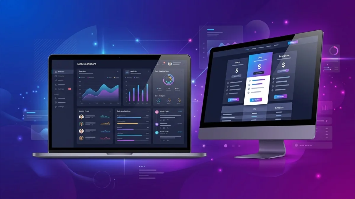
Homepage. Owns the brand's primary message. Answers in order: what you do, who it is for, why you are different, who trusts you, and what to do next. Homepage conversion actions are typically a demo CTA (enterprise or mid-market) or a trial sign-up (SMB or PLG). The homepage should route the visitor to the right next page — it should not try to close a deal on its own.
Features or product tour page. Shows the product in operational depth. Use annotated screenshots, short product video clips under 90 seconds, and feature-by-use-case structure rather than an alphabetical feature list. This is where buyers who are past awareness make the connection between the product's capabilities and their specific workflow problem.
Pricing page. The highest-exit and highest-intent page on most SaaS sites simultaneously. Visitors arrive having already decided they want a solution — the pricing page either confirms they can afford it and understand the value, or loses them to a competitor. Covered in detail below.
Solutions or use-case pages. Segment landing pages targeting a specific buyer profile — "field service management for HVAC companies," "project tracking for Canadian engineering firms," "client reporting for accounting practices in Ontario." These pages capture long-tail SEO traffic and significantly outperform generic pages for enterprise prospects arriving from a specific job-to-be-done search. For patterns on how solution pages fit your broader acquisition architecture, see the website design examples by industry guide.
Customers or case studies. Social proof that carries specifics — named company, named contact, specific measurable outcome: "Reduced manual reporting from one full day to forty minutes per week; the team now manages three additional client accounts without new headcount." Anonymous testimonials are background noise in 2026. Named case studies from recognizable Canadian companies close B2B deals.
Blog or resources. Drives organic acquisition and supports sales conversations. Not a vanity section — a compounding distribution channel. A SaaS blog targeting Canadian regulatory compliance topics, Canadian market-specific use cases, or Canadian industry benchmarks will outrank US content for Canadian buyers in ways that translate directly to inbound pipeline over 12–24 months.
Privacy policy and terms of service. Not an afterthought — compliance-critical pages that directly affect enterprise deal timelines. A Canadian SaaS company whose privacy policy does not reference PIPEDA and Law 25 will stall in procurement review at financial services, healthcare, and public-sector accounts that require evidence of Canadian data compliance before shortlisting.
SaaS pricing page design: the most revenue-critical page on the site
The pricing page is the site's highest-intent and most technically demanding page to design well. A visitor who arrives there has already cleared awareness and consideration — they want to know if they can afford the product and whether the tier structure fits their team. A badly designed pricing page loses deals the rest of the site already won.
Tier architecture. Three or four tiers with named buyer segments is the canonical structure in 2026. "Starter / Growth / Business / Enterprise" communicates which tier is appropriate based on company stage, not a buyer's willingness to decode a feature comparison. Never lead with a free plan unless your model is strictly PLG — putting "Free" as the first visible tier anchors price perception low and undermines the premium tiers that qualified buyers are actually evaluating.
Annual vs. monthly toggle. Show the toggle with annual selected as default and a high-contrast savings callout — "Save 20% with annual" in a coloured badge. Buyers who land on monthly pricing often do not realize an annual option exists unless the toggle is prominent and visible without scrolling. In Canada, enterprise buyers frequently require an annual invoice for internal budget approval, making CAD annual pricing the correct default for mid-market and above.
The recommended tier. Visually distinguish your target tier with a coloured card border, a "Most popular" badge, or a taller card in the layout. Without a visual anchor, buyers default to comparing cheapest versus most expensive rather than evaluating the recommended middle, which typically carries the strongest margin and is where most qualified buyers land. Most SaaS companies should recommend the second-highest tier.
Feature comparison below the fold. Tier cards — compact price plus three to five key features — belong above the fold. A full feature comparison table lives below. Never put all 40 features in the tier cards; it destroys readability on mobile and overwhelms evaluation on desktop. The table answers detailed questions; the cards close the emotional decision. Use progressive disclosure — collapse advanced rows behind an expandable toggle — rather than hiding the table entirely or relying on hover states that fail on mobile.
Social proof on the pricing page specifically. A three to five company logo wall positioned directly below the CTA buttons is among the highest-value design investments on this page. Enterprise buyers evaluating your pricing are simultaneously evaluating whether companies like theirs have trusted you. A recognizable Canadian logo — a named Crown corporation, a TSX-listed company, or a well-known provincial brand — carries more credibility with Canadian buyers than a US enterprise logo they have not encountered.
CAD pricing as the default. Display in CAD when your primary market includes Canadian customers. USD-only pricing causes two problems: buyers must mentally convert at an exchange rate they may not know, and they face unexpected foreign-exchange charges on their corporate card statements — a real friction point for finance-controlled procurement in Canadian enterprise accounts. Companies targeting both markets commonly serve a /ca/pricing/ page in CAD and a /us/pricing/ page in USD, with geo-detection defaulting to the appropriate version. For a full-page CRO framework applicable to pricing pages, see the conversion rate optimization and web design guide.
Demo vs. free trial: which CTA converts better for Canadian B2B SaaS?
The demo-versus-trial debate is one of the most consistently misunderstood questions in SaaS go-to-market strategy. Both answers are correct — for different buyer segments and ACV bands. Knowing which CTA to lead with on which page is a design decision with direct, measurable revenue implications.
For Canadian B2B SaaS with annual contract value above CA$10,000, a sales-led demo request reliably outperforms a free trial. Buyers at that price point are making a procurement decision that may require IT security review, legal sign-off, procurement approval, or budget justification to a CFO. A free trial without guided support does not move them through that process; a demo with a qualified sales engineer does. The design implication: the homepage hero CTA is "Request a demo," the demo form captures company size, use case, and current tool stack, and the confirmation page presents a calendar booking link rather than a static thank-you dead end.
For product-led growth SaaS with ACV under CA$5,000, a free trial or freemium entry point drives faster conversion and lower customer acquisition cost. The design implication: the hero CTA is "Start free" with a Google or LinkedIn sign-up option reducing friction to one click, the trial sign-up does not require a credit card, and the post-signup onboarding flow is treated as part of the design deliverable — not an afterthought wired up by the product team after the marketing site launches.
Many Canadian SaaS companies in 2026 run a dual-CTA structure on the homepage: a primary "Start free" button for SMB visitors and a secondary "Request a demo" ghost button or text link for mid-market and enterprise. Session recording data from heatmapping tools consistently shows that demo-intent visitors — arriving from LinkedIn campaigns targeting Director-level buyers, from branded search, or from referral links — click the secondary CTA at meaningfully higher rates than the primary. Giving them a clearly visible path is not splitting your message; it is routing your buyers correctly based on their entry point and intent signal.
Webflow for SaaS: the platform of choice in 2026
The platform question for SaaS websites has effectively converged for most company stages in 2026. Webflow dominates for early- and growth-stage companies. WordPress retains a strong position for content-heavy blogs and SEO-at-scale programs. Custom React (Next.js) or Gatsby builds become the only option that scales with design system complexity at Series B+ with multiple product lines and large product marketing organizations.
| Factor | Webflow | WordPress | Custom (Next.js) |
|---|---|---|---|
| Monthly hosting (CAD) | $40 – $65/mo | $20 – $100/mo managed WP | $150 – $1,200/mo infra |
| Marketing team autonomy | High — visual editor, no dev for copy/layout | Medium — Gutenberg, plugin dependencies | Low — all changes require dev PR |
| Custom animations & interactions | Native no-code editor | Requires GSAP or custom JS dev | Full control, full development cost |
| CRM integrations (HubSpot, Salesforce) | Native embed or Zapier | Plugin or custom webhook | Custom API integration required |
| SEO control | Good — full meta, schema, canonical control | Excellent — Yoast/RankMath, full schema | Full control, full responsibility |
| Bilingual EN/FR | Webflow Localization (2025+, native) | WPML or Polylang plugin | Custom i18n layer required |
| Typical design sprint | 6 – 10 weeks | 8 – 14 weeks | 3 – 6 months |
| Best suited for | Seed to Series B SaaS, PLG, marketing-led | Content-heavy SaaS, SEO-first strategy | Enterprise, design-system-driven, multi-product |
Webflow's principal advantage for SaaS companies is marketing team autonomy. When a product marketer needs to launch a new vertical solution page — say, a page targeting Canadian credit unions or federal government procurement — they can build and publish in Webflow without filing a development ticket. On a WordPress site, the same task requires a developer to configure the page template. On a custom React build, it requires a PR, review, and deployment cycle. At the cadence SaaS marketing teams operate, that developer dependency compounds into a significant go-to-market velocity disadvantage over 12–18 months of active campaign operations.
Webflow Localization, launched in 2025, now supports bilingual English/French sites natively — critical for Canadian SaaS companies targeting Quebec enterprise accounts or federal government contracts where French communication is a procurement requirement under the Official Languages Act. For deeper platform comparisons beyond the SaaS context, see the full platform comparison guide.
SaaS website design pricing in Canada (2026)
What a Canadian SaaS website design actually costs depends on four variables: the number of unique page templates, whether the scope includes custom animations and interactions, whether messaging strategy and copywriting are in scope, and whether the project includes SEO infrastructure and post-launch CRO testing. The ranges below reflect senior Canadian agency or freelance rates in 2026:
| Tier | Scope | CAD price range | Timeline |
|---|---|---|---|
| Webflow starter | Template customization, 8 – 12 pages, HubSpot integration, basic SEO setup | $6,000 – $12,000 | 5 – 7 weeks |
| Professional SaaS site | Custom Webflow design system, 15 – 25 pages, interactions, copywriting, GA4 events | $15,000 – $35,000 | 8 – 14 weeks |
| Growth-stage redesign | Messaging strategy + full design system, 25 – 50 pages, A/B testing infra, bilingual EN/FR | $35,000 – $75,000 | 14 – 22 weeks |
| Enterprise / custom build | React/Next.js, design system, multi-product architecture, WCAG 2.1 AA accessibility | $75,000 – $200,000+ | 4 – 9 months |
| CRO retainer | Monthly landing page tests, heatmap analysis, conversion reporting, iteration sprints | $2,500 – $6,000/mo | Ongoing |
These ranges assume a Canadian agency or senior Canadian Webflow specialist. Offshore design studios quote 40–60% lower, but the common failure modes — SaaS messaging written as generic filler, pricing pages that look fine in Figma but break on mobile, animations that degrade Core Web Vitals scores, and no working knowledge of PIPEDA or CASL requirements — typically cost more to remediate post-launch than the initial saving. Budget copywriting separately: a dedicated SaaS copywriter covering homepage, pricing, and three solution pages costs CA$5,000–$12,000 and typically generates more measurable conversion lift than an equivalent investment in visual polish alone. For total-cost context including platform subscriptions, see the website cost guide.
B2B funnel architecture: mapping your website to the buyer journey
B2B SaaS buyers do not follow a linear path through a website. They arrive from different sources — a LinkedIn ad targeting VPs of Finance at mid-sized Canadian manufacturers, a Google search for "project management software Canada," a referral link from an industry newsletter, or a podcast sponsor mention — each carrying different awareness levels and different next-step expectations. A website built around a single funnel for a single hypothetical buyer fails every real visitor.
Effective B2B funnel architecture maps each entry point to an appropriate destination. A LinkedIn campaign targeting Directors at Canadian financial services firms should land on a purpose-built financial-services solution page, not the generic homepage. A branded search query should land on a homepage that immediately validates the brand and routes to pricing or demo. A long-tail organic query like "construction project management software Ontario" should land on a page that names the industry problem, shows construction-specific product screenshots, and cites a construction-company customer reference — then routes directly to a demo form.
The three B2B funnel stages map to three distinct page types in a well-designed SaaS website. Awareness pages — blog posts, glossary entries, comparison pages like "Asana vs Monday for Canadian remote teams" — capture organic search traffic from buyers who know they have a problem but have not yet evaluated solutions. Consideration pages — solution pages, features pages, integration hubs — serve buyers actively comparing options. Decision pages — pricing, demo request, ROI calculator — capture buyers ready to move. A SaaS site that only has homepage and pricing depends entirely on paid traffic or brand demand to generate any pipeline at all. For specific landing page design patterns that apply across the funnel, see the landing page design guide.
The internal linking architecture of the site should mirror the funnel direction. A blog post about managing remote field teams in Canada should link to the relevant solution page; that solution page should link to customer case studies in the same vertical; those case studies should link to pricing. Buyers who follow this chain arrive at the pricing page with context, proof, and a defined set of expectations — dramatically increasing the likelihood they complete the demo form rather than bouncing to a competitor with clearer storytelling.
Product storytelling and messaging hierarchy
Messaging hierarchy is the sequencing of communication on a page — what you say first, what you say second, and how each element earns the reader's attention for the next. Most SaaS homepages fail at the first position: the hero headline names the product category rather than the buyer's problem, losing the majority of first-time visitors in the first ten seconds before they have seen a single differentiator.
The most durable SaaS homepage framework in 2026 is the four-layer hero. Problem statement in the headline — specific enough to trigger recognition from the exact buyer persona you are targeting. Outcome promise in the subheadline — specific, measurable, attributable, not generic. Product proof immediately below — an annotated product screenshot, a short demo video clip, or a UI preview showing the product doing something — not a stock illustration of diverse professionals at laptops. Social proof within the first scroll depth — five real customer logos or one named testimonial with a specific outcome data point. The primary CTA sits between the headline and the product proof, not below the fold.
The B2B demand generation and conversion specialists at Lead4Pro's SaaS website design practice run a structured messaging audit before every engagement — reviewing search query intent data, competitive headline analysis, and the exact language real customers use in sales call transcripts and G2 reviews — to ensure the final homepage copy matches the vocabulary buyers use when they describe the problem your product solves. Generic agency-written copy that sounds polished but uses no real customer language produces a website that looks done in Figma and fails in production once conversion analytics accumulate.
Product storytelling through the scroll — not just in the hero — means every scroll depth earns the next five seconds of attention. Below the hero: social proof (logos plus one specific metric). Next section: the differentiator moment — the single capability that sets your product apart from alternatives, shown in a real product screenshot. Next: a three-column pain-point summary targeting the three problems your buyers cite most frequently in discovery calls. Then: a named customer case study. Then: pricing. Then: FAQ. Then: the primary demo or trial CTA. This is not a rigid template — it is a narrative arc that must be validated against your specific ICP's buying psychology — but the principle holds across company stages and verticals.
SEO strategy for Canadian SaaS websites
SaaS SEO in Canada is a real, underexploited growth channel. Most Canadian SaaS companies underinvest in organic relative to paid acquisition, which creates a structural disadvantage: a company entirely reliant on Google Ads stops receiving traffic the moment the budget pauses. A company that has built organic rankings for its target queries earns qualified inbound traffic every month at zero marginal cost per click — and that traffic compounds rather than resets.
The Canadian-specific SEO opportunity for SaaS stems from a market gap: most SaaS SEO content is written for the US market. Pages targeting "project management software for Canadian healthcare organizations," "CRA T4 slip management software," or "CASL-compliant email marketing platform Canada" face meaningfully weaker competition than their generic US-market equivalents. A Canadian SaaS company that publishes 30–50 well-targeted, long-form Canadian-context articles over 18 months — covering regulatory topics, Canadian market benchmarks, Canadian use cases — typically sees organic inbound grow to represent 30–50% of total demo requests without ongoing ad spend. The investment is front-loaded; the return compounds.
Technical SEO requirements for SaaS sites: correct canonical URLs for product sub-pages and blog pagination, hreflang tags for bilingual EN/FR content, an XML sitemap submitted to Google Search Console and Bing Webmaster Tools, structured data (Service, FAQPage, BreadcrumbList schemas) on pricing and solution pages, and Core Web Vitals passing — LCP under 2.5 seconds, INP under 200ms, CLS under 0.1 — measured on real mobile LTE, not desktop simulation. The most common technical SEO failure specific to SaaS sites is JavaScript-heavy product tour pages that take 6–10 seconds to render on mobile and present no indexable content on first parse. Use server-side rendering for all pages targeted for organic acquisition. Webflow does this natively. Next.js requires explicit configuration. For Canadian-specific SEO strategy covering geo-targeting and local signals, the local SEO guide covers patterns directly applicable to SaaS companies with regional customer concentrations in Toronto, Vancouver, Montreal, Calgary, or Ottawa.
PIPEDA, CASL, and Law 25: what Canadian SaaS compliance requires on your website
Canadian regulatory requirements for SaaS companies are more substantive than most founders realize and directly affect website design decisions — not just the legal page buried in the footer.
PIPEDA (Personal Information Protection and Electronic Documents Act) applies to any SaaS company collecting personal data from Canadian individuals, regardless of where the company is incorporated. It requires an accessible privacy policy specifying what data is collected, for what purpose, for how long, and with whom it is shared; a mechanism for users to request access to or deletion of their data; and a data breach notification obligation. On the website, this means a clearly linked privacy policy in the footer and on every sign-up form, a documented data deletion process accessible without a support ticket, and a cookie consent mechanism that withholds analytics and advertising pixels — Google Analytics 4, Meta Pixel, LinkedIn Insight Tag — before the visitor provides explicit consent. The Office of the Privacy Commissioner of Canada at priv.gc.ca publishes a compliance self-assessment specifically for software businesses.
CASL (Canada's Anti-Spam Legislation) governs every commercial electronic message sent to a Canadian address — including trial welcome emails, onboarding sequences, product update announcements, and sales follow-up emails triggered by a demo request form submission. CASL requires either express consent — an opt-in checkbox, not pre-checked, on the sign-up form — or implied consent based on an existing business relationship within the prior two years. The consent language must specify what type of emails will be sent. Your CRM must store timestamped consent records per contact. A CASL violation carries penalties up to CA$10 million per violation under the Act — this is not a theoretical legal edge case.
Quebec's Law 25 (Act respecting the protection of personal information in the private sector) adds requirements beyond PIPEDA for any company serving Quebec individuals: a named privacy officer whose title and contact information must be publicly accessible on the website, a privacy impact assessment for any new technology processing personal data, a breach notification obligation to the Commission d'accès à l'information (CAI) within 72 hours of discovery, and explicit consent for any cross-border transfer of personal data outside Canada. For SaaS companies whose infrastructure runs on US-based AWS or Azure regions, the cross-border transfer requirement has real design implications — a data residency disclosure on the security or privacy page is standard practice in enterprise Canadian SaaS sales cycles, and Quebec public-sector and healthcare procurement teams routinely require documented Law 25 compliance before shortlisting a vendor.
Core Web Vitals and performance for SaaS websites
Core Web Vitals are Google's user-experience performance signals that directly affect organic search ranking. SaaS websites — routinely loaded with marketing JavaScript, CRM chatbots, analytics tags, heatmapping scripts, A/B testing SDKs, and embedded product tour iframes — accumulate performance debt faster than simpler sites. The impact on SEO and conversion is real and measurable.
The three metrics that matter: LCP (Largest Contentful Paint) measures how long the main hero image or headline takes to render — target under 2.5 seconds on mobile LTE. For SaaS sites, the most common LCP failure is a hero section that loads a large background video or animated illustration before text content renders, pushing the headline past the 2.5-second threshold. INP (Interaction to Next Paint) measures responsiveness to user interactions — target under 200 milliseconds. Heavy JavaScript execution from third-party marketing tools is the leading INP failure on SaaS marketing sites. CLS (Cumulative Layout Shift) measures visual stability — target under 0.1. Cookie consent banners that insert themselves above the fold after the page renders are the most common CLS failure on PIPEDA-compliant SaaS sites, and the fix — reserving layout space for the banner via CSS before JavaScript executes — is a design-phase decision, not a retrofit.
Practical fixes: lazy-load all third-party scripts and fire them only after explicit user interaction or a minimum three-second delay; serve hero images in WebP format with explicit width and height attributes to prevent layout shift during load; host fonts locally or use font-display:swap to prevent render-blocking; and run Google PageSpeed Insights monthly on the mobile throttled LTE test — not the desktop simulation — to catch regressions introduced by new marketing tag deployments. A SaaS marketing site that passes Core Web Vitals ranks higher, loads faster for Canadian mobile users on regional carrier networks, and converts at a meaningfully higher rate than one that does not.
Step-by-step: how a Canadian SaaS website design project unfolds
Most SaaS website projects fail not because of bad design but because of process failures — scope changes after mockups are approved, copy arriving four weeks late, conflicting feedback from three stakeholders with different product visions, or a launch-day deployment that breaks the HubSpot form integration. A disciplined process prevents all of these. Here is the standard workflow for a professional Canadian SaaS website build:
- Discovery and messaging strategy (2 – 3 weeks). Stakeholder interviews to establish ICP, primary use cases, differentiators, and objections. Competitive analysis of five comparable SaaS sites. Customer interview synthesis pulling exact language from call recordings, G2 reviews, or Typeform post-trial surveys. Output: a messaging document with headline options, segment definitions, funnel architecture map, and a priority-ordered page list. This phase is skipped by most design-first agencies and accounts for the majority of conversion failures six months post-launch.
- Site architecture and content plan (1 week). A complete sitemap defining every page, its conversion goal, its target keyword or traffic source, and its funnel position. Client approval on architecture before wireframes begin — changing the site structure after visual design is underway is expensive and common.
- Copywriting (2 – 3 weeks, parallel with wireframes). Homepage, pricing, three to five solution pages, and about page. Written to the messaging document by a writer who understands B2B SaaS positioning — not a generalist copywriter who interviews the founder once. SaaS copy requires an understanding of PLG versus sales-led motion, ICP segmentation, and benefit statements that survive the "so what?" test.
- Wireframes and UX architecture (1 – 2 weeks). Low-fidelity wireframes for the five highest-traffic page templates — homepage, pricing, solution page, blog post, demo request. Show funnel logic, CTA placement, and page-to-page routing. Client approval required before visual design begins.
- Visual design in Figma (2 – 3 weeks). High-fidelity mockups for all approved page templates on mobile and desktop. Brand colour system, typography scale, component library, and motion language defined for reuse across all pages. Two rounds of client revision are standard in fixed-fee projects; additional rounds bill at hourly rate.
- Webflow development (3 – 5 weeks). Design system built in Webflow; all pages developed and connected; CRM form integrations — HubSpot or Salesforce — configured and tested with real submissions; PIPEDA-compliant cookie consent banner integrated and verified in DevTools; GA4 conversion events firing and validated in DebugView; bilingual Webflow Localization configured if in scope.
- QA and performance audit (1 – 2 weeks). Cross-browser testing on Chrome, Safari, Firefox, and Edge; real-device testing on a current iPhone and Android flagship plus an iPhone SE for small-screen edge cases; Core Web Vitals audit on PageSpeed Insights mobile; CASL opt-in verification; WCAG 2.1 AA baseline accessibility check; broken-link scan; all form submissions tested end-to-end including CRM record creation and automated email delivery.
- Launch and 30-day post-launch monitoring (2 days + 30 days). DNS cutover with TTL prepared in advance; SSL certificate verification; canonical URL review; sitemap submitted to Google Search Console and Bing Webmaster Tools; GA4 real-time event monitoring for 48 hours post-launch. Set 30-day and 90-day CRO reviews on the calendar: heatmap session recordings and funnel analysis will reveal friction patterns that no pre-launch testing can simulate — real user behaviour on real traffic is the only reliable signal.
Pre-launch SaaS website checklist
Use this as acceptance criteria before sign-off. Every unchecked item is a conversion risk, a compliance exposure, or a technical debt item that costs more to address after launch than before:
- Homepage hero headline names a specific problem or buyer segment — not a generic product category
- Primary CTA (demo request or trial sign-up) is visible above the fold on mobile at 375px viewport width without scrolling
- Demo form or trial sign-up tested end-to-end: submission → CRM record created → confirmation email delivered
- Pricing page displays CAD as default; annual/monthly toggle works on mobile without layout breakage
- Recommended or featured pricing tier is visually distinguished by colour, badge, or card height
- Feature comparison table is present below the pricing cards and readable on a 375px-wide mobile screen
- CASL-compliant email consent checkbox is present on sign-up forms, not pre-checked, with specific consent language
- Cookie consent banner fires before analytics, heatmap, and ad pixels load — verified in browser DevTools Network tab with cache cleared
- Privacy policy page references PIPEDA; if selling to Quebec, references Law 25 and names the privacy officer
- Terms of service page is linked from footer and from all sign-up form pages
- All pages pass Core Web Vitals: LCP under 2.5 seconds, INP under 200ms, CLS under 0.1 — tested on PageSpeed Insights mobile throttled LTE, not desktop
- SSL enforced on all pages; no mixed-content warnings in browser console
- Google Analytics 4 configured with conversion events: demo form submit, trial sign-up, pricing page view — verified in GA4 DebugView before launch
- Google Search Console property verified; XML sitemap submitted; no crawl errors flagged
- Canonical URLs correct on all pages including blog sub-pages, paginated content, and Webflow CMS collection pages
- All images served in WebP format with explicit width and height attributes set — no CLS from image reflow on load
- 404 page returns actual HTTP 404 status code and includes a site search field and primary navigation
- Chat widget (if present) loads deferred — does not block LCP or cause CLS on mobile
- If bilingual: French pages tested with French browser locale; hreflang tags verified for all EN/FR pairs
- Customer logos and case study names confirmed as permission-cleared from the referenced companies
For general web platform and technical SEO pre-launch items not specific to SaaS, see the small business website checklist.
Common mistakes SaaS founders make with website design
These errors appear on SaaS sites repeatedly across markets, company stages, and design budgets. Most are invisible during internal review and become apparent only after conversion analytics have accumulated:
Designing for the founder's mental model, not the buyer's. Founders know their product's technical architecture in depth and tend to organize the website around features rather than outcomes. "Automated multi-step approval workflows" is a feature. "Cut your procurement approval cycle from eight days to same-day" is a value proposition. Buyers purchase the second version; they scroll past the first. No amount of visual design investment recovers a page built around a feature-first structure.
Using the homepage as the only landing page for all paid traffic. A generic homepage converting all paid visitors at 2% looks acceptable in aggregate but masks the reality that purpose-built landing pages matched to specific ads and audiences convert at 7–12%. A Canadian SaaS company running three LinkedIn campaigns targeting Finance Directors, IT Managers, and Operations VPs should have three post-click landing pages, each naming that persona's specific problem. One homepage serving all three targets none of them effectively.
Hiding pricing entirely. For any SaaS product with self-serve plans under CA$500 per month, hiding pricing consistently increases bounce rates and erodes trust. Buyers who find no pricing go to G2 or Capterra to find it — and they rarely return. Display at least a starting price or a clear range. The objection that "our pricing is complex and requires a sales call" is almost never true for SMB tiers and is a common rationalization for avoiding a conversion rate problem by reframing it as a process decision.
Launching without a content strategy. A SaaS site without a blog or resources section is entirely dependent on paid traffic from the moment it launches. A company that builds 30 targeted resource articles over the first 18 months — covering the specific long-tail queries their ICPs type into Google — begins compounding organic inbound from month nine onward. Delaying the content investment by 12 months delays the compound return by 12 months. Content should be scoped into the initial website project, not deferred to a phase two that typically never ships.
Underestimating the mobile first impression. The majority of first-touch SaaS website visits in 2026 happen on mobile — even for B2B products targeting enterprise buyers. The research phase: reading about your product, seeing who uses it, forming an initial opinion of quality and credibility — happens on a phone during a commute or between meetings. The demo request or trial sign-up may happen on desktop, but the first impression that determines whether that conversion ever happens was formed on a 6-inch screen. A SaaS site that looks exceptional on a 27-inch monitor but is frustrating to navigate on mobile loses the first impression for the majority of its traffic before a single word of copy is read.
Treating PIPEDA and CASL as post-launch legal tasks. Retrofitting a compliant cookie consent mechanism, CASL-compliant sign-up form, and Law 25-referenced privacy policy after a SaaS site is live typically costs two to three times as much as scoping them into the initial build and often requires design changes that break finished components. Canadian compliance is a design specification, not a legal afterthought. Any agency building a SaaS website for a Canadian company that does not raise PIPEDA, CASL, and Law 25 during the discovery phase is not a specialist in this market.
Case study: Calgary B2B SaaS cuts trial-to-paid conversion rate 28 points post-redesign
A Calgary-based B2B SaaS company serving the Canadian construction industry (anonymized at the company's request) launched in 2023 with a WordPress site built by a generalist agency. By Q1 2025 the product had 200 trial sign-ups per month but a trial-to-paid conversion rate of 6% — roughly half the benchmark for horizontal project management SaaS. Analytics showed that 78% of trial users never completed the onboarding flow. The website's messaging described generic "project management," which had attracted a broad, poorly qualified audience — people who started a trial because the homepage sounded relevant but whose workflow did not match the product's actual strengths.
The intervention. A 12-week Webflow redesign — CA$42,000 fully scoped including messaging strategy, copywriting, and bilingual setup — began with a structured messaging audit: customer interview analysis of 23 churned accounts, 31 expansion accounts, and 12 recently closed new deals. The recurring language from expansion accounts was strikingly specific: "it handles our submittals and RFI tracking in one place" and "our site supervisors actually use it because the mobile app works offline on remote sites." Neither differentiator appeared on the original website. The redesign rebuilt the homepage headline around the submittals and RFI use case; created three solution pages for general contractors, subcontractors, and project owners; rebuilt the pricing page with a clearly recommended "Field Team" tier that addressed the mobile offline objection directly in the feature description; and added four named case studies from recognizable Alberta and British Columbia construction firms. The cookie consent banner was rebuilt to PIPEDA standard, and CASL-compliant opt-in language was added to all trial sign-up forms.
The outcome. Trial sign-ups declined 15% in the first month — the new messaging attracted a narrower but more qualified audience. Trial-to-paid conversion rate rose from 6% to 34% within 90 days of launch, a 28-point improvement. Monthly recurring revenue grew 28% in the same period on modestly declining trial volume. The redesign recovered its full CA$42,000 investment in the first month of improved conversion rates. The marketing team launched six additional vertical solution pages in Webflow in the subsequent quarter without a single developer ticket.
Frequently asked questions about SaaS website design in Canada
How much does SaaS website design cost in Canada?
SaaS website design in Canada typically runs CA$8,000–$35,000 for a professional Webflow build and CA$35,000–$200,000+ for a fully custom React/Next.js design system. Annual CRO retainers and maintenance add CA$2,500–$6,000 per month for growth-stage companies running ongoing A/B testing programs. Webflow hosting adds CA$40–$65 per month on top of design fees, billed by Webflow directly.
Should a Canadian SaaS company use Webflow or WordPress?
Webflow is the platform of choice for most Canadian SaaS companies in 2026. It gives marketing teams full visual control without developer involvement, supports custom animations natively, and integrates with HubSpot, Salesforce, and common SaaS analytics stacks. WordPress remains strong for content-heavy blogs and SEO at scale. Custom Next.js builds are justified only at Series B+ when design system complexity and multi-product requirements exceed what Webflow supports.
What should a SaaS pricing page include?
A SaaS pricing page should include three to four tiers with named buyer segments, an annual/monthly toggle with a visible savings callout, a visually distinguished recommended tier, a full feature comparison table below the pricing cards, social proof — a logo wall or named testimonial — directly below the CTAs, and an FAQ section addressing cancellation terms, data portability, and CAD versus USD billing for Canadian buyers.
Demo request vs. free trial: which CTA converts better?
Neither is universally better — it depends on annual contract value. For B2B SaaS with ACV above CA$10,000, a sales-led demo request outperforms free trials because buyers at that price point need guided evaluation and procurement support. For PLG SaaS with ACV under CA$5,000, a no-credit-card free trial drives lower CAC and faster activation. Many Canadian SaaS companies run both: a primary free trial CTA for SMB visitors and a secondary demo ghost button for enterprise and mid-market prospects on the same homepage.
Does a SaaS website need to comply with PIPEDA and CASL?
Yes. PIPEDA applies to any SaaS company collecting personal data from Canadian users. CASL governs commercial emails — trial onboarding sequences, demo follow-ups, product announcements — and requires express or implied consent before sending. Quebec's Law 25 adds a named privacy officer requirement, breach notification within 72 hours to the CAI, and privacy impact assessments for new technology. These requirements directly affect sign-up form design, cookie consent banners, and privacy policy content and should be scoped into the initial website project, not retrofitted after launch.
How many pages does a SaaS website need?
A minimal viable SaaS website requires eight pages: homepage, features or product overview, pricing, demo or contact, blog or resources, about, privacy policy, and terms of service. Growth-stage companies add solution pages per vertical or use case, a customer case studies section, a changelog or product updates hub, and an integrations directory. Each page should map to a defined buyer-journey stage and a specific conversion goal — adding pages without that clarity is waste.
How long does a SaaS website design project take?
A professional SaaS website on Webflow takes six to fourteen weeks from discovery to launch: two to three weeks for messaging strategy and wireframes, two to three weeks for visual design in Figma, three to five weeks for Webflow development and QA. Adding copywriting, bilingual EN/FR localization, and post-launch CRO infrastructure extends each phase by two to four weeks. Custom React/Next.js builds run three to six months. The fastest reliable path for a 15- to 25-page SaaS site is a focused Webflow sprint with design and development running in parallel where dependencies allow.
Should Canadian SaaS companies price in CAD or USD on their website?
Companies with primarily Canadian buyers should display CAD as the default pricing currency. USD-only pricing introduces friction, unexpected foreign-exchange charges on corporate cards, and signals that the product was not built for the Canadian market. Companies serving both markets often run separate /ca/pricing/ and /us/pricing/ pages with geo-detection routing visitors to the appropriate version. For Quebec enterprise and government RFPs, CAD invoicing is standard and often required by procurement policy.
Get a free SaaS website design plan
Tell us about your SaaS product — we'll send back a platform recommendation, page architecture, and a scope estimate. No payment required.