The one idea that settles 90% of the debate
Almost every "Grid or Flexbox?" question is really one question in disguise: is this layout one-dimensional or two-dimensional?
Flexbox lays out items along a single axis at a time. You pick a direction — a row or a column — and Flexbox distributes the items along that line. It can wrap onto multiple lines, but each line is still managed on its own; Flexbox does not try to line items up into shared columns across those lines. That is the meaning of "one-dimensional." It is content-out: you give it items, and it figures out the spacing based on their natural size and the rules you set.
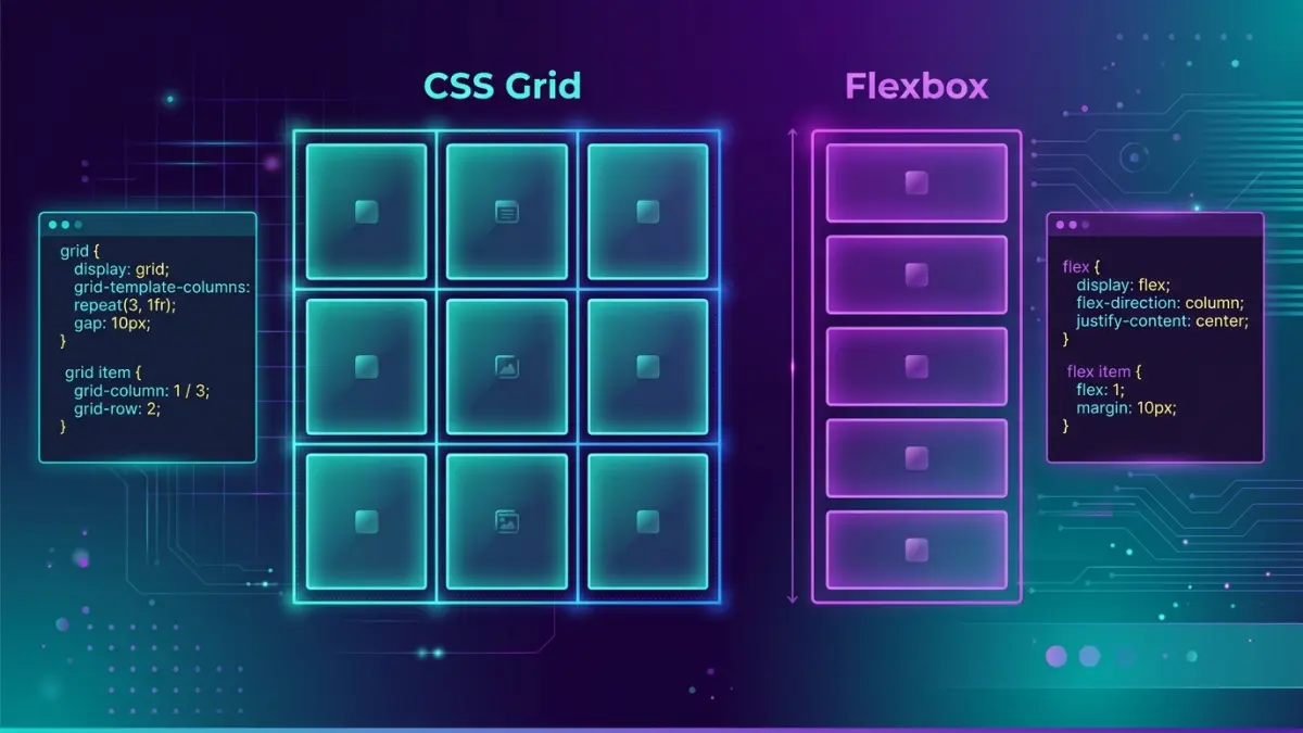
CSS Grid lays out items in rows and columns simultaneously. You define a track structure first — "three columns, two rows, with this gap" — and then place items into that structure. Items in row two line up perfectly under items in row one because they share the same column tracks. That is "two-dimensional," and it is layout-in: you define the grid, then drop content into it.
When you can answer "do I care about alignment in both directions at once?" you have your answer. A navbar is a single row — one dimension — so it is a Flexbox job. A photo gallery where every card must line up into neat columns and rows is two dimensions — a Grid job. Hold onto that distinction; the rest of this guide is just applying it to real components.
A 60-second mental model
Here is the fastest way to internalize the difference. Picture a row of books on a shelf. Flexbox is the shelf: it spaces the books along one line, lets you push them left, right, or centre, and lets you decide whether they grow to fill gaps. You do not pre-decide how many slots the shelf has — you put books on and they arrange themselves.
Now picture a printer's type case or a muffin tin: a fixed set of compartments arranged in rows and columns. That is Grid. You decide the compartments first — how many across, how many down, how big each one is — and then you place things into specific compartments. A muffin in the third compartment of the second row is exactly under the muffin in the third compartment of the first row, because the compartments are aligned by design.
Shelf = Flexbox = content arranges along one line. Muffin tin = Grid = content drops into a predefined two-dimensional structure. Keep both images in your head and you will reach for the right tool by instinct.
Flexbox in practice: the patterns you will actually use
Let's start with the everyday Flexbox jobs. These four patterns cover the vast majority of one-dimensional layout work on a real website.
1. The navbar — logo left, links right. This is the canonical Flexbox case and it is two properties.
.nav {
  display: flex;
  align-items: center;          /* vertical centring on the cross axis */
  justify-content: space-between; /* logo pushed left, links pushed right */
  gap: 24px;
  padding: 16px 24px;
}

/* HTML
<nav class="nav">
  <a class="logo">WebDesignGuide</a>
  <div class="links"><a>Pricing</a><a>Blog</a><a>Contact</a></div>
</nav> */
2. Perfect centring — the thing CSS was once mocked for. Centring a box both ways used to be a meme. Flexbox makes it three lines.
.hero {
  display: flex;
  align-items: center;     /* centre vertically */
  justify-content: center; /* centre horizontally */
  min-height: 60vh;
}
3. The "push one item away" toolbar. A card footer with metadata on the left and an action on the far right. margin-left: auto on the last item eats all the free space.
.card-footer {
  display: flex;
  align-items: center;
  gap: 12px;
}
.card-footer .action {
  margin-left: auto;  /* shove this button to the far right */
}
4. The flexible media object. A fixed-size avatar beside text that grows to fill the rest. This is where flex-grow, flex-shrink, and flex-basis — bundled into the flex shorthand — earn their keep.
.media { display: flex; gap: 16px; align-items: flex-start; }
.media .avatar { flex: 0 0 56px; }  /* don't grow, don't shrink, stay 56px */
.media .body   { flex: 1 1 auto; }  /* grow to fill the remaining space */
Notice what all four share: a single line of content (or a single column), where the job is to distribute and align along that line. None of them care about lining items up into shared columns across multiple rows. That is the Flexbox sweet spot.
CSS Grid in practice: the patterns you will actually use
Now the two-dimensional jobs. These are the layouts that get painful in Flexbox and trivial in Grid.
1. The responsive card gallery with no media queries. This single rule is the most useful Grid pattern on the web. It fits as many columns as will fit at a minimum width, then wraps — and it reflows on its own at every screen size.
.gallery {
  display: grid;
  grid-template-columns: repeat(auto-fit, minmax(240px, 1fr));
  gap: 24px;
}
Read it as: "make as many columns as fit, each at least 240px wide, sharing leftover space equally." On a phone you get one column; on a tablet, two or three; on a desktop, four or five — with zero breakpoints. Swap auto-fit for auto-fill if you want empty trailing tracks to be preserved rather than collapsed.
2. The classic page shell with named areas. Header, sidebar, main, footer — described in plain words. This is the pattern Flexbox cannot do cleanly because it spans two dimensions.
.page {
  display: grid;
  grid-template-columns: 240px 1fr;
  grid-template-rows: auto 1fr auto;
  grid-template-areas:
    "header  header"
    "sidebar main"
    "footer  footer";
  min-height: 100vh;
  gap: 16px;
}
.page > header  { grid-area: header; }
.page > .side   { grid-area: sidebar; }
.page > main    { grid-area: main; }
.page > footer  { grid-area: footer; }
3. The "holy grail" that reorders on mobile. Because the layout lives in grid-template-areas, switching to a stacked mobile layout is just redrawing the ASCII map in a media query — no markup changes.
@media (max-width: 720px) {
  .page {
    grid-template-columns: 1fr;
    grid-template-areas:
      "header"
      "main"
      "sidebar"
      "footer";
  }
}
4. Spanning items across tracks for a feature layout. A magazine-style grid where the first card is twice as wide and tall as the rest.
.feature-grid {
  display: grid;
  grid-template-columns: repeat(4, 1fr);
  grid-auto-rows: 200px;
  gap: 16px;
}
.feature-grid .hero-card {
  grid-column: span 2;  /* take two columns */
  grid-row: span 2;     /* take two rows */
}
Every one of these cares about both axes at once. The cards line up into columns and rows; the page shell positions regions in a 2D map. That is the Grid signal: when alignment in two directions matters simultaneously, Grid is the right tool and the code is shorter than the Flexbox workaround would be.
The decision table — pick a tool in five seconds
Print this, pin it above your monitor, and the daily decision becomes automatic. The left column describes the layout problem; the right column tells you which tool to reach for and why.
| Your layout problem | Reach for | Why |
|---|---|---|
| Navbar / header bar | Flexbox | One row, content-driven spacing |
| Button or tag group | Flexbox | Items sized by content, wrap as needed |
| Centre a box both ways | Flexbox | Two lines on a single container |
| Sidebar + main page shell | Grid | Two-dimensional region map |
| Responsive card gallery | Grid | auto-fit + minmax, no breakpoints |
| Image / photo grid | Grid | Aligned columns and rows |
| Dashboard with spanning widgets | Grid | span columns and rows precisely |
| Pricing table row of plans | Either / both | Grid for columns, Flexbox inside each plan |
| Form: label + field rows | Grid | Labels align in a shared column |
| Aligning icon + text in a chip | Flexbox | One axis, vertical centring |
| Sticky footer below content | Either | Flex column or grid 1fr row both work |
| Equal-height cards in a row | Either | Both stretch by default; Grid if columns matter |
The "Either / both" rows are not a cop-out — they are the most important rows. They are exactly the components where the production answer is to nest the two tools, which is the next section.
They are not rivals: how to combine Grid and Flexbox
The single biggest misconception is that you must choose one tool for a whole project. You do not. The most maintainable real-world layouts use Grid for the outer structure and Flexbox for the inner alignment, dozens of times across a page.
Think of it as zoom levels. At the page-and-section zoom level — where you are positioning regions and arranging cards into a gallery — you are almost always two-dimensional, so Grid wins. Zoom into a single card, and now you have a vertical stack of an icon, a title, body text, and a button pinned to the bottom: one axis, content-driven, so Flexbox wins. Same page, two tools, each doing what it is best at.
Here is a pricing section that demonstrates the pattern end to end. Grid lays out the three plans into aligned columns; Flexbox stacks each plan's contents and glues the button to the bottom so all three buttons line up even when the feature lists differ in length.
/* MACRO: Grid arranges the plans into aligned columns */
.pricing {
  display: grid;
  grid-template-columns: repeat(auto-fit, minmax(260px, 1fr));
  gap: 24px;
  align-items: stretch;   /* every plan card is the same height */
}

/* MICRO: Flexbox stacks each card's contents vertically */
.plan {
  display: flex;
  flex-direction: column;
  gap: 12px;
}
.plan .features { flex: 1 1 auto; } /* features area grows... */
.plan .cta      { margin-top: auto; } /* ...so every CTA sits flush at the bottom */
This is the pattern to default to. When you catch yourself asking "Grid or Flexbox for this whole page?" the honest answer is usually "Grid for the skeleton, Flexbox for the muscles." Mixing them is not a compromise; it is the recommended approach in every modern CSS team I have worked with.
Gap, alignment, and the properties that work in both
A lot of confusion comes from not realizing how much vocabulary the two systems share. Learn these once and they transfer between both tools.
gap works in both. It used to be Grid-only, but every current browser has supported gap on Flexbox since 2021. Stop using margins for spacing between flex or grid items — gap never adds an unwanted edge margin and never needs the old "negative margin on the parent" hack.
justify-content and align-items exist in both, but mean subtly different things. In Flexbox, justify-content distributes items along the main axis (the direction you set with flex-direction) and align-items works on the cross axis. In Grid, justify-* always refers to the inline (row) axis and align-* to the block (column) axis, regardless of content flow. The practical takeaway: in Flexbox, "justify" follows your chosen direction; in Grid, "justify" is always horizontal in a standard left-to-right document.
place-items and place-content are shorthand for setting both axes at once. place-items: center on a grid container centres every item in its cell both ways — the cleanest "centre everything" you can write.
/* Centre a single child, the modern way */
.box { display: grid; place-items: center; min-height: 50vh; }

/* The Flexbox equivalent for comparison */
.box { display: flex; align-items: center; justify-content: center; min-height: 50vh; }
Both snippets centre their child. Use whichever fits the surrounding code — if the container is already a grid, use place-items; if it is already a flex container, use the two-property version. Do not add a Grid container purely to centre one thing inside an existing Flexbox component.
Responsive patterns: doing more with fewer media queries
Modern layout lets you build responsive components that adapt on their own, before a single breakpoint is written. Here are the workhorse responsive techniques for each tool.
Flexbox: wrap and basis. Set flex-wrap: wrap and give each item a flex-basis, and the row breaks onto new lines as space runs out — a self-flowing tag cloud or button bar.
.tags {
  display: flex;
  flex-wrap: wrap;
  gap: 8px;
}
.tags li { flex: 0 1 auto; }  /* size to content, shrink if needed, wrap */
Grid: auto-fit minmax. As shown earlier, this is the no-media-query gallery. The difference from Flexbox wrap is that Grid keeps the items aligned into shared columns as they wrap, while Flexbox lines are independent. If you want a ragged last row that hugs the left, Flexbox wrap is fine; if you want a tidy grid where the last row's items still sit under the columns above, use Grid.
.cards {
  display: grid;
  grid-template-columns: repeat(auto-fit, minmax(min(100%, 280px), 1fr));
  gap: 20px;
}
That min(100%, 280px) wrapper inside minmax is a small but important detail: it prevents the grid from overflowing its container on very narrow screens where 280px would be wider than the viewport. Without it, a fixed minmax floor can cause horizontal scrollbars on small phones — a common bug worth memorizing the fix for.
Container queries: the newer lever. Since 2023, container queries let a component respond to the width of its parent container rather than the whole viewport. That means a card can switch from a stacked Flexbox layout to a side-by-side one based on whether it sits in a wide main column or a narrow sidebar — without knowing anything about the screen size.
.card-wrap { container-type: inline-size; }

.card { display: flex; flex-direction: column; gap: 12px; }

@container (min-width: 420px) {
  .card { flex-direction: row; }  /* go side-by-side only when the container is wide */
}
Container queries do not replace Grid or Flexbox — they replace many of the media queries you used to wrap around them. Combined with auto-fit grids and flex-wrap, a surprising number of layouts in 2026 ship with zero or one breakpoint. For a Canadian audience on a mix of phones, tablets, and desktops, that is fewer states to test and fewer ways to break.
Subgrid: the feature that closed the last gap
For years, one real limitation pushed people back toward awkward workarounds: a nested grid could not align its tracks to its parent's tracks. If you had a row of cards and wanted every card's title, body, and footer to line up across cards regardless of how long each title was, you had to fake it. Subgrid fixed this, and as of late 2023 it works in Chrome, Edge, Firefox, and Safari.
.cards { display: grid; grid-template-columns: repeat(3, 1fr); gap: 24px; }

.card {
  display: grid;
  grid-template-rows: subgrid;  /* inherit the parent's row tracks */
  grid-row: span 3;             /* this card spans 3 parent rows: title / body / footer */
  gap: 8px;
}
Now the titles of all three cards share one row track, the bodies share another, and the footers share a third — perfectly aligned even when one title wraps to two lines and another fits on one. Before subgrid, this required fixed heights or JavaScript measurement. It is the kind of detail that separates a layout that looks "almost right" from one that looks intentionally designed.
If your project still has to support an older browser without subgrid, the graceful fallback is to let the cards size naturally — the layout stays usable, it just loses the cross-card row alignment. That is a cosmetic degradation, not a broken page, which makes subgrid safe to adopt today for most Canadian commercial audiences.
Browser support and what it means for your project
Support is no longer a reason to avoid either tool. The table below summarizes where each feature stands in 2026 and what action, if any, you need to take.
| Feature | Supported since | Global support | Action needed |
|---|---|---|---|
| Flexbox | 2015 (all engines) | ~99% | None — use freely |
| CSS Grid | 2017 (all engines) | ~97%+ | None for modern audiences |
| gap in Flexbox | 2021 | ~96% | None for current browsers |
| Subgrid | 2023 (all engines) | ~92% | Optional cosmetic fallback |
| Container queries | 2023 | ~91% | Progressive enhancement |
| IE 11 Grid (-ms-) | Old prefixed syntax only | End of life | Only if a client mandates IE11 |
The practical guidance for a Canadian business site in 2026: use Flexbox and Grid without fallbacks. Internet Explorer 11 is past end of support and effectively absent from real commercial traffic. The only projects that still need the old -ms-grid prefixed syntax are locked-down enterprise or government intranets with a hard IE11 requirement — and if you are building one of those, that constraint will be stated up front in the brief. For everyone else, write modern CSS and move on.
When you do need to gate a newer feature, use @supports rather than browser sniffing. It asks the browser directly whether it understands a property, which is reliable and future-proof.
@supports (grid-template-rows: subgrid) {
  .card { grid-template-rows: subgrid; }
}
Common mistakes that waste hours
These are the recurring errors that send developers down rabbit holes. Recognizing them early is the difference between a ten-minute layout and a two-hour fight.
- 🚩 Forcing a 2D grid out of Flexbox. The number-one mistake: building a card gallery with
display:flex, fixedwidth: 33.33%on each card, and a negative-margin hack for the gap. It breaks the instant content lengths differ or an extra card appears. If you are setting percentage widths on flex items to make columns line up, stop and switch to Grid — that is precisely the problem Grid solves in one rule. - 🚩 Using Grid for a simple one-line layout. The reverse error. Spinning up a full grid template just to put a logo on the left and links on the right is overkill — Flexbox does it in two properties and reads more clearly to the next developer. Match the tool to the dimensionality.
- 🚩 Confusing the main axis after changing flex-direction. When you set
flex-direction: column,justify-contentnow controls the vertical distribution andalign-itemsthe horizontal. People setalign-items: centerexpecting vertical centring in a column and get horizontal centring instead. Remember: justify follows the main axis, align follows the cross axis, and the main axis flips when you flip the direction. - 🚩 Fighting flex item overflow with text. A flex item containing long text or a wide element refuses to shrink and blows out the layout. The fix is
min-width: 0on the flex item — flex items default tomin-width: auto, which stops them shrinking below their content's intrinsic size. This one bug accounts for a huge share of "my flexbox is overflowing" support threads. - 🚩 Using margins instead of gap. Setting
margin-righton every item and then fighting the trailing margin on the last one is legacy thinking. Usegap— it spaces between items only, never on the outer edges, in both Grid and Flexbox. - 🚩 Fixed minmax floors causing mobile scrollbars.
minmax(280px, 1fr)overflows on phones narrower than 280px. Wrap the floor inmin()—minmax(min(100%, 280px), 1fr)— so the track can shrink below 280px when the viewport demands it. - 🚩 Animating layout properties. Animating
width,height, or grid track sizes triggers expensive layout recalculation on every frame and stutters on low-end devices. Animatetransformandopacityinstead — they run on the compositor and stay smooth. This is a performance rule that applies to both Grid and Flexbox containers. - 🚩 Ignoring source order and accessibility. Grid's
orderand explicit placement let you display items in a different visual order than the HTML source. Screen readers and keyboard tab order follow the source, not the visual layout, so a reordered grid can create a confusing experience. Keep the DOM order logical and use visual reordering sparingly and deliberately.
A step-by-step way to choose, every time
When you are staring at a component and genuinely unsure, walk this short checklist top to bottom. The first "yes" is your answer.
- Is it a single row or single column of content? If yes, use Flexbox. Navbars, button groups, breadcrumbs, toolbars, chip rows, and vertical stacks within a card are all one-dimensional. Stop here.
- Do items need to align into shared columns across multiple rows? If yes, use Grid. Card galleries, photo grids, and any "tidy rows and columns" layout need the cross-row alignment only Grid provides natively.
- Is it a whole-page or whole-section skeleton? If yes, use Grid with named areas. The header/sidebar/main/footer shell is the textbook Grid case, and named areas make the mobile reflow a one-block change.
- Do you need precise placement or spanning? If items must start at a specific column, span multiple tracks, or overlap, use Grid. Flexbox has no concept of explicit cell coordinates.
- Is it the inner content of a Grid cell or a card? If yes, use Flexbox inside it. Once Grid has positioned the box, Flexbox aligns the icon, heading, text, and button within. This is the combine-both pattern.
- Still unsure? Default to Flexbox for components and Grid for layouts. It is faster to upgrade a too-simple Flexbox component to Grid later than to unwind an over-engineered grid. When in doubt, build the simpler one first.
Worked example: a real landing-page section
Let's tie it together with a layout you would actually ship: a "features" section with a three-up card grid, where each card has an icon, a heading, a paragraph, and a link pinned to the bottom. This is the combine-both pattern in miniature, and it is responsive without a single media query.
<section class="features">
  <article class="feature">
    <div class="icon">⚡</div>
    <h3>Fast hosting</h3>
    <p>Canadian edge nodes keep load times under a second nationwide.</p>
    <a class="more" href="#">Learn more →</a>
  </article>
  <!-- two more .feature articles -->
</section>
/* GRID: lay the cards out, responsive, no media query */
.features {
display: grid;
grid-template-columns: repeat(auto-fit, minmax(min(100%, 260px), 1fr));
gap: 24px;
}
/* FLEXBOX: stack each card and pin the link to the bottom */
.feature {
display: flex;
flex-direction: column;
gap: 10px;
padding: 24px;
border: 1px solid #e5e7eb;
border-radius: 16px;
}
.feature p { flex: 1 1 auto; } /* paragraph absorbs the slack */
.feature .more { margin-top: auto; } /* link sits flush at the bottom of every card */On a phone the cards stack into one column; on a tablet, two; on a desktop, three — handled entirely by auto-fit plus minmax. Within each card, Flexbox guarantees the "Learn more" links align along the bottom even when one paragraph runs three lines and another runs one. Roughly fifteen lines of CSS, no JavaScript, no breakpoints, and it degrades gracefully on any browser from the last eight years. That is the modern baseline you should expect from a competent build — and what a good agency delivers as a matter of course.
Performance and maintainability notes
A frequent question is which tool is "faster." For the layouts on a normal website, the honest answer is that the difference is negligible. Both Grid and Flexbox are native browser layout engines, both are dramatically faster than the float-and-clearfix era they replaced, and both are far cheaper than any JavaScript-driven layout library. Choosing Grid over Flexbox will not make or break your Core Web Vitals.
Where layout performance actually suffers is elsewhere: deeply nested layout trees that force the browser to recalculate many levels at once, animating geometric properties like width and height instead of transforms, oversized unoptimized images that dominate the largest-contentful-paint metric, and layout shifts caused by content loading without reserved space. None of these are Grid-versus-Flexbox problems. Fix those, and your layout choice is a rounding error.
The maintainability gain is the real reason to choose correctly. When the tool matches the problem, the CSS is short, the intent is obvious to the next developer, and changes are localized. When you fight a one-dimensional tool to do a two-dimensional job, you accumulate fixed widths, magic numbers, and negative-margin hacks that break under the first content change. The cheapest performance and maintenance win available is simply picking the right tool the first time — which is what this entire guide is about.
If you are weighing whether to hand a build to a freelancer or an agency, the layout quality you have just read about is exactly the kind of thing that separates a CA$2,000 template job from a properly engineered front-end. The web design pricing guide breaks down what each tier buys, the small-business website checklist covers the must-haves to specify in your brief, and the platform comparison helps you choose the CMS the layout will live in.
FAQ: CSS Grid vs Flexbox
What is the difference between CSS Grid and Flexbox?
Flexbox is one-dimensional — it arranges items along a single axis, a row or a column. CSS Grid is two-dimensional — it controls rows and columns at the same time. Use Flexbox for content-driven distribution along one line; use Grid for full layouts where items drop into a defined set of rows and columns.
Should I use Grid or Flexbox for a navbar?
Use Flexbox. A navbar is a single row of links with a logo, which is the one-dimensional case Flexbox was built for. justify-content: space-between plus align-items: center solves it in two lines. Reach for Grid only when a header needs a fixed three-zone layout with a truly centred middle.
Can I use CSS Grid and Flexbox together?
Yes, and you usually should. Grid for the macro layout — page shell or card gallery — and Flexbox inside each cell or card to align an icon, title, text, and button. Grid handles the structure; Flexbox handles the alignment within a component. Mixing them is the recommended approach.
Is CSS Grid well supported in browsers in 2026?
Yes. Grid has worked in every current browser since 2017 and global support is above 97%. Subgrid reached all major engines by late 2023. You can use Grid without fallbacks for modern audiences. Only projects with a hard Internet Explorer 11 requirement need the old prefixed syntax or a Flexbox fallback.
Which is faster, CSS Grid or Flexbox?
For typical layouts the difference is negligible — both are native, GPU-friendly engines far faster than floats or JavaScript grids. Real performance problems come from deeply nested trees, animating width or height, and oversized images, not from the Grid-versus-Flexbox choice. Matching the tool to the layout keeps your code simpler, which is the genuine win.
Do I still need media queries with CSS Grid?
Often no. Grid's repeat(auto-fit, minmax()) reflows card galleries with no media query, and Flexbox flex-wrap does the same for content rows. You still use media queries — or container queries — when you want to change the layout structure itself at a breakpoint, like moving a sidebar above the content on mobile.
What is the most common Flexbox mistake?
Using Flexbox to build a true two-dimensional grid with fixed percentage widths and negative-margin hacks. It breaks the moment content length changes. If you are fighting Flexbox to align items across rows and columns, that is the signal to switch to Grid, which solves it natively in a couple of lines.
When should I use Grid instead of Flexbox?
Use Grid when the layout is two-dimensional — alignment in both directions matters at once. Page shells, image galleries, dashboards, pricing tables, and any design where items align to shared column tracks across rows are Grid problems. If the layout is a single row or column of content, use Flexbox.
Want this layout built and shipped for your business?
Tell us your site type, budget range, and city — we send back a realistic price range and a responsive, accessibility-aware build plan within one business day.